Type Palette & Format Bar
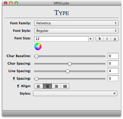
The type palette gives you sophisticated type controls. Picking fonts and styles is as simple as choosing them from the menu. If you are not sure what one of the sliders does, try selecting a block of text and dragging the sliders around. If you are used to picking fonts through the font picker that is native to the computer, read the page on Fonts Palette.

Font Family
This drop down menu allows you to choose from the fonts you have saved to your font library.
Font Style
The contents of the drop down menu for font styles depends on the font you have selected. For example, Lucida Grande offers only regular and bold font styles. Times New Roman offers regular, italic, bold, and bold italic. If italics is greyed out or not present, then that font does not offer italics as a font style.
Font Color
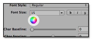
To pick the color of your font from the type palette, press the color wheel. (Note: you can also change the color from the fonts palette and format bar).

Char Baseline
The baseline is the line on which the letters sit, and which the descenders extend below. The baseline is automatically set to 0. Increasing the baseline separates the lines of text further from one another.
Char Spacing
Kerning is the space between the letters. Kerning can adjust the space between two letters, especially between letters with slanted sides like V, W, and A. For example, in the word "varied" there is typically a larger space between V and A than between the rest of the letters. To kern, highlight the letter before the space you wish to adjust. Then adjust the character spacing until the spacing between the V and A looks even with the spacing between the letters in the rest of the word.
Line Spacing
Line Spacing is the space between the baseline and the top of the next line of text, also called leading. The lower the number the more the lines will come together. The higher the number the more they will separate.
Paragraph Spacing
The Paragraph Space (❡ Spacing) is the space between your paragraphs.
Paragraph Alignment
For more on this topic, read alignment.
Styles
Styles are presets of size, color, typeface, and other font attributes that you can quickly apply to the text you have selected. Try selecting some text and using one of the styles in the styles pull down. To delete a style, select it from the pull down menu while holding down the option key. If you have more questions about styles, check out the VoodooPad Text Styles page.
Pro Tip: Hold down the option key when dragging on the sliders in the Type Palette if you wish to work with fractional values rather than whole numbers.
Format Bar

The format bar can be turned on under VoodooPad ▸ Preferences ▸ Editing ▸ Use format bar for rich text pages. The format bar is located under the toolbar and contains many of the same features as the type palette including text styles, font styles, font color, paragraph alignment, as well as lists and bullets.